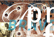
Wim Crouwel
Crowel’s big break came in 1956 when Edy de Wilde, then director of the Van Abbemuseum, gave him an initial graphic design commission that resulted in a regular partnership with Crouwel to design all of the museum’s printed material. For Crouwel, de Wilde was an ideal client who allowed him the freedom to experiment and create new fonts, which he would then use in his designs. When Crouwel was asked if design was pure problem solving or whether there was also room for personal expression, he responded, “Of course design is about problem solving, but I cannot resist adding something personal. A page should have tension.”
April Greiman
April Greiman was a designer in New York City in the mid-1970s when she decided to leave the comfort of a design community deeply entrenched in European tradition for an uncertain future on the opposite coast. Seeking a new spirit, she moved to Los Angeles and entered a culture that, for better or for worse, had a limited aesthetic of its own at that time. Museums and galleries were few and it was impossible to get a decent cup of coffee. But the lack of an established design practice created a unique opportunity to explore new paradigms in communications design.
David Carson
David Carson is a prominent contemporary graphic designer and art director. His unconventional and experimental graphic style revolutionized the graphic designing scene in America during 1990s. He was the art director of the magazine Ray Gun, in which he introduced the innovative typographies and distinct layouts. He is claimed to be the godfather of ‘grunge typography’ which he employed perpetually in his magazine issues.
Marian Bantjes
Marian’s art and design crosses boundaries of time, style and technology. She is known for her detailed and lovingly precise vector art, her obsessive hand work, her patterning and ornament. Marian’s work has an underlying structure and formality that frames its organic, fluid nature. It is these combinations and juxtapositions that draw the interest of such a wide variety of designers and typographers, from experienced formalists to young students.
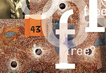
Game Over
Cornel Windlin & Gilles Gavillet
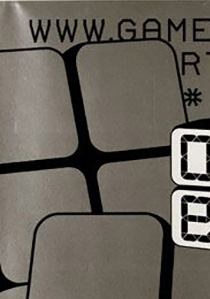
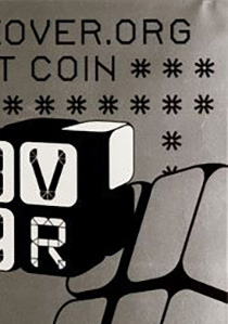
Game Over, a poster created by Swiss designers Cornel Windlin and Gilles Gavillet for an exhibit on computer games, displays two different typefaces made using computer game design software. As if reinterpreting Crouwel’s grid-based experiment of the 1960s, the poster contains the word “OVER” on the face of a die divided into four cells. Each cell contains one letter of the word, forming what looks like a grid out of the word. Windlin completed the entire design on the computer, without so much as a preliminary hand-drawn sketch. The computer not only served him in a methodological sense, but also as a source of direct inspiration.
Visuele Communicatie Nederland
Wim Crouwel
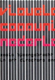
This poster was designed by Wim Crouwel and printed by Steendrukkerij de Jong and Company and made for (as the client) Stedelijk Musuem. It is dated 1969 and we acquired it in 2009. Its medium is offset lithograph on wove paper. It is a part of the Drawings, Prints, and Graphic Design department. Crowel’s big break came in 1956 when Edy de Wilde, then director of the Van Abbemuseum, gave him an initial graphic design commission that resulted in a regular partnership with Crouwel to design all of the museum’s printed material. For Crouwel, de Wilde was an ideal client who allowed him the freedom to experiment and create new fonts, which he would then use in his designs.
Before My Memory Goes
Marian Bantjes
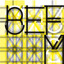
Each year for the annual AGI Congress, members are asked to contribute to a special project. The 2011 theme was “Modular” and the colour requirement was yellow and black. Marian’s art and design crosses boundaries of time, style and technology. She is known for her detailed and lovingly precise vector art, her obsessive hand work, her patterning and ornament. Marian’s work has an underlying structure and formality that frames its organic, fluid nature. It is these combinations and juxtapositions that draw the interest of such a wide variety of designers and typographers, from experienced formalists to young students.
Punk London Identity
Neville Brody
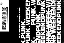
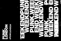
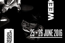
To celebrate the 40th anniversary of the explosion of punk in London, the Greater London Authority (GLA) planned a series of events for Punk.London that needed a unified communications presence. Brody Associates created and shared a distributable brand identity system, visual language, and Peace Riot, an anchoring typeface to mark the occasion.
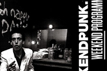
Smithsonian Institute
David Carson
This piece of artwork by the talented David Carson was commissioned for the Smithsonian Institute, Washington DC in July of 2014. David Carson is a man who has transformed the field of graphic design throughout his career. Self-taught, resolutely grid-free, and unafraid to speak his mind (he’s also very funny), Carson’s work made designers realize that editorial layouts didn’t have to stick to the rules around image placement, consistent typography, or doggedly flowing copy issue after issue.
HorseProjectSpace Presents: Ritual Tendencies
Michiel Schuurman
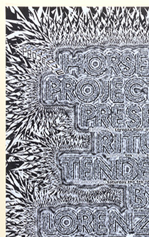
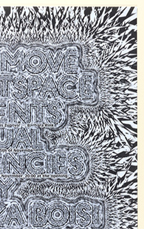
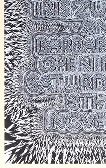
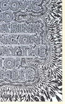
This poster was designed by Michiel Schuurman. Its medium is offset lithograph on white wove paper. HorseProjectSpace Presents: Ritual Tendencies (2007, represents a camp of more “machine oriented” designers. The poster pointedly obscures words in a sharp geometric design that resembles jagged crystal. The words meld into its crags, their meanings eclipsed by the poster’s dynamism.
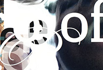
Your Turn, My Turn
April Greiman
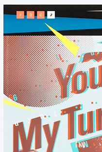
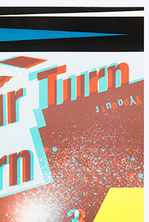
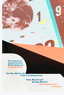
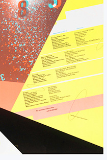
The idiosyncratic graphic designer April Greiman designed the poster Your Turn, My Turn for a 1983 symposium in Los Angeles, California. The conference aimed to discuss the roles of artists, designers, and architects within the field of design and possibilities for multidisciplinary collaboration. In deference to the conference’s ambitions, Greiman embraces innovation and freedom in her design by manipulating traditional forms with contemporary tools.
Maps, Demographic and Economy
Paula Scher
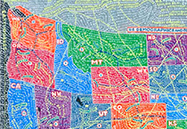
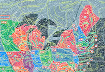
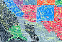
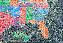
Paula is respected as one of America’s greatest liberal designers. It is inevitable therefore that our conversation at some point turns to Trump. Within her team at Pentagram, Paula explains that a shift has already begun since the start of his presidency. A proudly global group of associates, “there are things that have changed that I have felt already,” particularly in terms of employment and visas. “If Trump is talking about a good deal for American business, this isn’t.” But most of all it is the discussions the designer heard 40 years ago resurfacing that she finds worrying.